Your graphics add a nice touch to my presentations and I recently used them for one of my all-hands meetings. Your toolbox adds professionalism to my slides. Instead of using standard clipart.
Claude Jones, Director of Engineer, @Walmartlabs, USA
Your graphics add a nice touch to my presentations and I recently used them for one of my all-hands meetings. Your toolbox adds professionalism to my slides. Instead of using standard clipart.
Claude Jones, Director of Engineer, @Walmartlabs, USA
I needed a fresh look at some of my slides. I've tried to find a way to create a paintbrush effect, to underline, accentuate, add some color and the handwritten markers were just the things. Very easy to use, easy to size, change the color. It was an affordable, perfect solution and I'm happy to recommend it.
Anonymous, US
The crisp, clean look of the graphics, and the fact that it allowed me to easily edit and change the colors to match the template was my main reason for purchasing them.
Brandie Jenkins, E-learning Developer, USA
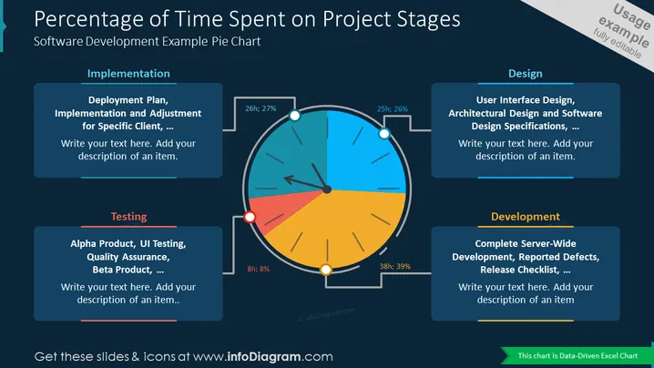
Diagramme en Secteurs
Ce modèle de diapositive PowerPoint fournit une visualisation claire et concise du pourcentage de temps passé sur les différentes étapes d'un projet de développement logiciel. Le diagramme en secteurs communique efficacement la proportion relative de temps allouée à chaque étape, en faisant un outil précieux pour la planification de projet, le suivi des progrès et les présentations de gestion des ressources. Les fonctionnalités éditables du modèle permettent une personnalisation pour s'adapter aux données spécifiques du projet et aux besoins de présentation.


