Your graphics add a nice touch to my presentations and I recently used them for one of my all-hands meetings. Your toolbox adds professionalism to my slides. Instead of using standard clipart.
Claude Jones, Director of Engineer, @Walmartlabs, USA
Your graphics add a nice touch to my presentations and I recently used them for one of my all-hands meetings. Your toolbox adds professionalism to my slides. Instead of using standard clipart.
Claude Jones, Director of Engineer, @Walmartlabs, USA
I needed a fresh look at some of my slides. I've tried to find a way to create a paintbrush effect, to underline, accentuate, add some color and the handwritten markers were just the things. Very easy to use, easy to size, change the color. It was an affordable, perfect solution and I'm happy to recommend it.
Anonymous, US
The crisp, clean look of the graphics, and the fact that it allowed me to easily edit and change the colors to match the template was my main reason for purchasing them.
Brandie Jenkins, E-learning Developer, USA
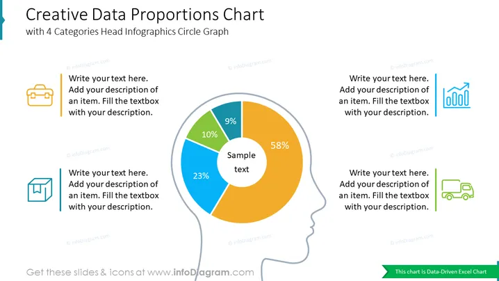
Ce diaporama PowerPoint offre une manière visuellement attrayante et informative de présenter les proportions de données pour quatre catégories différentes. Le design de l'infographie présente un graphique circulaire central divisé en quatre segments colorés, chacun représentant une catégorie spécifique. Les proportions sont clairement affichées en pourcentage et en valeurs numériques. Ce diaporama est idéal pour mettre en avant les parts de marché, la distribution des produits, l'allocation budgétaire ou toute autre donnée pouvant être divisée en quatre segments proportionnels.


