Your graphics add a nice touch to my presentations and I recently used them for one of my all-hands meetings. Your toolbox adds professionalism to my slides. Instead of using standard clipart.
Claude Jones, Director of Engineer, @Walmartlabs, USA
Your graphics add a nice touch to my presentations and I recently used them for one of my all-hands meetings. Your toolbox adds professionalism to my slides. Instead of using standard clipart.
Claude Jones, Director of Engineer, @Walmartlabs, USA
I needed a fresh look at some of my slides. I've tried to find a way to create a paintbrush effect, to underline, accentuate, add some color and the handwritten markers were just the things. Very easy to use, easy to size, change the color. It was an affordable, perfect solution and I'm happy to recommend it.
Anonymous, US
The crisp, clean look of the graphics, and the fact that it allowed me to easily edit and change the colors to match the template was my main reason for purchasing them.
Brandie Jenkins, E-learning Developer, USA
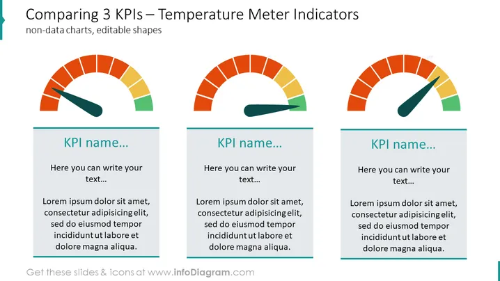
Cette diapositive est conçue pour comparer trois indicateurs clés de performance (KPI) différents en utilisant une analogie visuelle avec des mètres de température. Chaque mètre représente un KPI différent et est accompagné d'une zone de texte pour le nom du KPI et d'une plus grande boîte pour une description ou une analyse détaillée. Les KPI sont des mesures quantifiables utilisées pour évaluer le succès d'une organisation, d'un employé, etc., dans l'atteinte des objectifs de performance.


