Your graphics add a nice touch to my presentations and I recently used them for one of my all-hands meetings. Your toolbox adds professionalism to my slides. Instead of using standard clipart.
Claude Jones, Director of Engineer, @Walmartlabs, USA
Your graphics add a nice touch to my presentations and I recently used them for one of my all-hands meetings. Your toolbox adds professionalism to my slides. Instead of using standard clipart.
Claude Jones, Director of Engineer, @Walmartlabs, USA
I needed a fresh look at some of my slides. I've tried to find a way to create a paintbrush effect, to underline, accentuate, add some color and the handwritten markers were just the things. Very easy to use, easy to size, change the color. It was an affordable, perfect solution and I'm happy to recommend it.
Anonymous, US
The crisp, clean look of the graphics, and the fact that it allowed me to easily edit and change the colors to match the template was my main reason for purchasing them.
Brandie Jenkins, E-learning Developer, USA
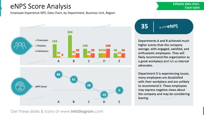
La diapositive présente une analyse du Net Promoter Score d'Expérience Employé (eNPS) par département. Elle met en évidence que les départements A et B affichent des scores plus élevés, indiquant des employés engagés et enthousiastes susceptibles d'apporter leur soutien à l'organisation. Le département D, en revanche, affiche des scores plus faibles, reflétant une insatisfaction et une expression négative potentielle envers l'entreprise. Les éléments graphiques incluent un graphique à barres et un graphique linéaire représentant respectivement les promoteurs, les passifs, les détracteurs et les scores eNPS.
Dans l'ensemble, la diapositive utilise une hiérarchie visuelle claire, combinant des graphiques à barres et des graphiques linéaires pour communiquer efficacement les données et les informations eNPS avec un design structuré.


