

Your graphics add a nice touch to my presentations and I recently used them for one of my all-hands meetings. Your toolbox adds professionalism to my slides. Instead of using standard clipart.
Claude Jones, Director of Engineer, @Walmartlabs, USA

Your graphics add a nice touch to my presentations and I recently used them for one of my all-hands meetings. Your toolbox adds professionalism to my slides. Instead of using standard clipart.
Claude Jones, Director of Engineer, @Walmartlabs, USA
I needed a fresh look at some of my slides. I've tried to find a way to create a paintbrush effect, to underline, accentuate, add some color and the handwritten markers were just the things. Very easy to use, easy to size, change the color. It was an affordable, perfect solution and I'm happy to recommend it.
Anonymous, US
The crisp, clean look of the graphics, and the fact that it allowed me to easily edit and change the colors to match the template was my main reason for purchasing them.
Brandie Jenkins, E-learning Developer, USA
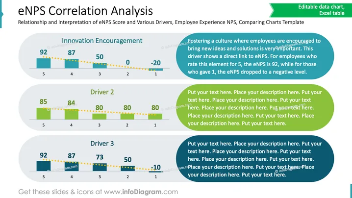
La diapositive explore la relation entre l'encouragement des employés pour l'innovation et les scores eNPS. Elle catégorise les scores en fonction des évaluations des employés, où une évaluation plus élevée est corrélée à un eNPS plus élevé. Chacun des trois facteurs montre comment les changements dans la perception des employés affectent le score net de promoteur, avec des baisses notables à mesure que les évaluations diminuent.
Globalement, la diapositive est visuellement organisée pour présenter clairement les corrélations de données et offre un format structuré facile à lire. L'utilisation de schémas de couleurs cohérents aide à distinguer les sections.



