Your graphics add a nice touch to my presentations and I recently used them for one of my all-hands meetings. Your toolbox adds professionalism to my slides. Instead of using standard clipart.
Claude Jones, Director of Engineer, @Walmartlabs, USA
Your graphics add a nice touch to my presentations and I recently used them for one of my all-hands meetings. Your toolbox adds professionalism to my slides. Instead of using standard clipart.
Claude Jones, Director of Engineer, @Walmartlabs, USA
I needed a fresh look at some of my slides. I've tried to find a way to create a paintbrush effect, to underline, accentuate, add some color and the handwritten markers were just the things. Very easy to use, easy to size, change the color. It was an affordable, perfect solution and I'm happy to recommend it.
Anonymous, US
The crisp, clean look of the graphics, and the fact that it allowed me to easily edit and change the colors to match the template was my main reason for purchasing them.
Brandie Jenkins, E-learning Developer, USA
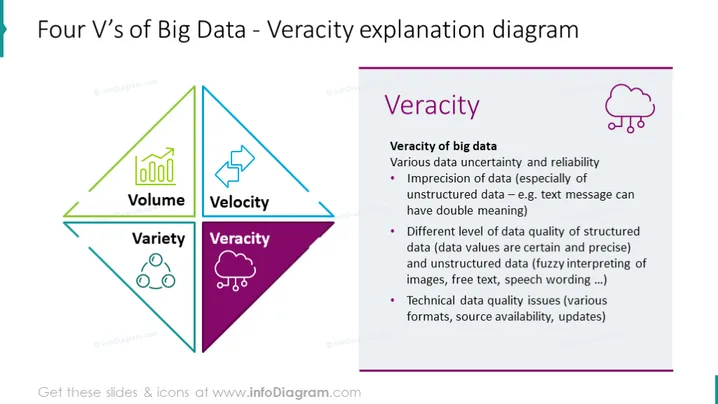
La diapositiva se centra en la 'Veracidad' en el contexto de Big Data, abordando la incertidumbre y los problemas de fiabilidad asociados con los datos. Describe la imprecisión de los datos no estructurados, como los mensajes de texto con significados ambiguos, y señala los diferentes niveles de calidad de los datos entre datos estructurados (precisos y definitivos) y datos no estructurados (sujetos a interpretación). También toca cuestiones de calidad técnica relacionadas con el formato, la disponibilidad y las actualizaciones.
El diseño de la diapositiva es elegante y visualmente atractivo, utilizando diferenciación de colores e íconos temáticos para subrayar el aspecto de 'Veracidad' de Big Data. Combina elementos visuales con explicaciones concisas para transmitir su mensaje de manera efectiva.


