Your graphics add a nice touch to my presentations and I recently used them for one of my all-hands meetings. Your toolbox adds professionalism to my slides. Instead of using standard clipart.
Claude Jones, Director of Engineer, @Walmartlabs, USA
Your graphics add a nice touch to my presentations and I recently used them for one of my all-hands meetings. Your toolbox adds professionalism to my slides. Instead of using standard clipart.
Claude Jones, Director of Engineer, @Walmartlabs, USA
I needed a fresh look at some of my slides. I've tried to find a way to create a paintbrush effect, to underline, accentuate, add some color and the handwritten markers were just the things. Very easy to use, easy to size, change the color. It was an affordable, perfect solution and I'm happy to recommend it.
Anonymous, US
The crisp, clean look of the graphics, and the fact that it allowed me to easily edit and change the colors to match the template was my main reason for purchasing them.
Brandie Jenkins, E-learning Developer, USA
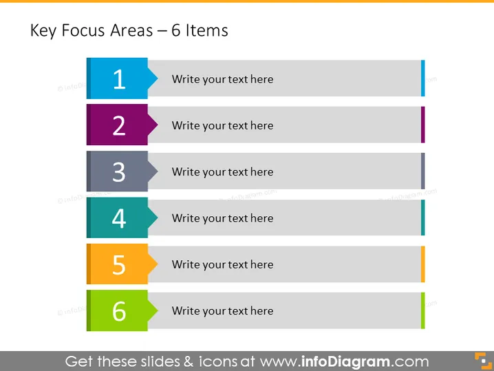
La diapositiva muestra una lista de "Áreas Clave de Enfoque" con seis elementos, cada uno representado por un banner numerado seguido del texto de marcador de posición "Escribe tu texto aquí." Estos banners están destinados a resaltar seis prioridades o temas distintos. Por ejemplo, el número "1" podría representar la prioridad más inmediata o el primer paso en un proceso, con los números siguientes en orden de importancia o secuencia.
La diapositiva tiene un diseño limpio y moderno con una estructura clara que facilita la lectura y comprensión. El uso de colores diferentes ayuda a distinguir cada área de enfoque.


