Your graphics add a nice touch to my presentations and I recently used them for one of my all-hands meetings. Your toolbox adds professionalism to my slides. Instead of using standard clipart.
Claude Jones, Director of Engineer, @Walmartlabs, USA
Your graphics add a nice touch to my presentations and I recently used them for one of my all-hands meetings. Your toolbox adds professionalism to my slides. Instead of using standard clipart.
Claude Jones, Director of Engineer, @Walmartlabs, USA
I needed a fresh look at some of my slides. I've tried to find a way to create a paintbrush effect, to underline, accentuate, add some color and the handwritten markers were just the things. Very easy to use, easy to size, change the color. It was an affordable, perfect solution and I'm happy to recommend it.
Anonymous, US
The crisp, clean look of the graphics, and the fact that it allowed me to easily edit and change the colors to match the template was my main reason for purchasing them.
Brandie Jenkins, E-learning Developer, USA
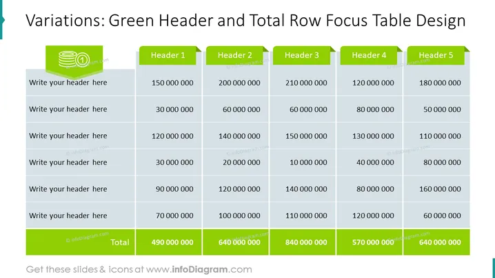
La diapositiva muestra una tabla diseñada para resaltar información utilizando un encabezado verde para los títulos de las columnas como "Encabezado 1" a "Encabezado 5" y una fila de totales en la parte inferior. Cada encabezado probablemente representa una categoría o métrica diferente que debe ser completada por el presentador. Las filas de la tabla parecen ser marcadores de posición para encabezados adicionales y datos numéricos correspondientes, con la fila inferior calculando totales a través de las columnas, demostrando la suma de los datos numéricos ingresados arriba.
El aspecto general de la diapositiva es moderno y centrado en los negocios, con un tema de color distintivo para los elementos de enfoque. Los resaltados verdes guían la atención del espectador hacia los encabezados y totales, creando una fuerte jerarquía visual.


