Your graphics add a nice touch to my presentations and I recently used them for one of my all-hands meetings. Your toolbox adds professionalism to my slides. Instead of using standard clipart.
Claude Jones, Director of Engineer, @Walmartlabs, USA
Your graphics add a nice touch to my presentations and I recently used them for one of my all-hands meetings. Your toolbox adds professionalism to my slides. Instead of using standard clipart.
Claude Jones, Director of Engineer, @Walmartlabs, USA
I needed a fresh look at some of my slides. I've tried to find a way to create a paintbrush effect, to underline, accentuate, add some color and the handwritten markers were just the things. Very easy to use, easy to size, change the color. It was an affordable, perfect solution and I'm happy to recommend it.
Anonymous, US
The crisp, clean look of the graphics, and the fact that it allowed me to easily edit and change the colors to match the template was my main reason for purchasing them.
Brandie Jenkins, E-learning Developer, USA
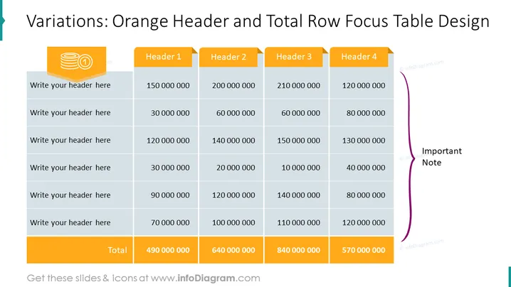
Esta diapositiva de PowerPoint presenta una tabla diseñada para comparar datos numéricos en cuatro categorías, etiquetadas como Encabezado 1 a Encabezado 4. Está estructurada para llamar la atención sobre los totales de cada categoría, resaltados en naranja en la fila inferior. Cada fila anterior al total es para un artículo o variable diferente, que se puede detallar insertando una descripción del encabezado, con los valores numéricos extendiéndose de izquierda a derecha en las columnas correspondientes.
Se coloca una sección de "Nota Importante" a la derecha de la tabla, enfatizando información adicional que puede complementar los datos presentados.
La diapositiva tiene un diseño profesional y claro, con fuertes señales visuales que dirigen la atención hacia la fila de totales y la sección de nota importante. El uso del color es estratégico y mejora la legibilidad de los datos.


