Your graphics add a nice touch to my presentations and I recently used them for one of my all-hands meetings. Your toolbox adds professionalism to my slides. Instead of using standard clipart.
Claude Jones, Director of Engineer, @Walmartlabs, USA
Your graphics add a nice touch to my presentations and I recently used them for one of my all-hands meetings. Your toolbox adds professionalism to my slides. Instead of using standard clipart.
Claude Jones, Director of Engineer, @Walmartlabs, USA
I needed a fresh look at some of my slides. I've tried to find a way to create a paintbrush effect, to underline, accentuate, add some color and the handwritten markers were just the things. Very easy to use, easy to size, change the color. It was an affordable, perfect solution and I'm happy to recommend it.
Anonymous, US
The crisp, clean look of the graphics, and the fact that it allowed me to easily edit and change the colors to match the template was my main reason for purchasing them.
Brandie Jenkins, E-learning Developer, USA
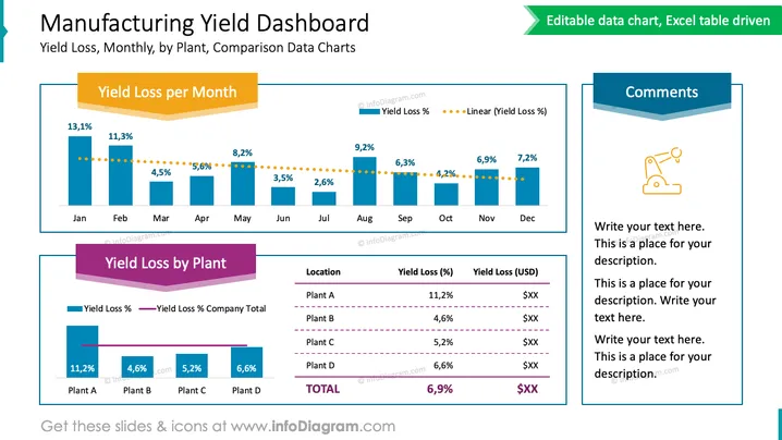
Esta diapositiva de PowerPoint titulada "Tablero de Rendimiento de Manufactura" presenta una comparación de datos de pérdida de rendimiento a través de diferentes períodos de tiempo y ubicaciones. El primer gráfico, "Pérdida de Rendimiento por Mes," ilustra el porcentaje de pérdida de rendimiento para cada mes, con los porcentajes disminuyendo a lo largo del año. La tendencia a la baja se enfatiza con una línea punteada que representa una tendencia lineal de los porcentajes de pérdida de rendimiento. El segundo gráfico, "Pérdida de Rendimiento por Planta," contrasta los porcentajes de pérdida de rendimiento y los valores en dólares en cuatro diferentes ubicaciones de plantas, destacando la variabilidad en el rendimiento. Un panel lateral titulado "Comentarios" proporciona espacio para notas adicionales, que podrían usarse para explicar los datos o sugerir ideas accionables.


