

Your graphics add a nice touch to my presentations and I recently used them for one of my all-hands meetings. Your toolbox adds professionalism to my slides. Instead of using standard clipart.
Claude Jones, Director of Engineer, @Walmartlabs, USA

Your graphics add a nice touch to my presentations and I recently used them for one of my all-hands meetings. Your toolbox adds professionalism to my slides. Instead of using standard clipart.
Claude Jones, Director of Engineer, @Walmartlabs, USA
I needed a fresh look at some of my slides. I've tried to find a way to create a paintbrush effect, to underline, accentuate, add some color and the handwritten markers were just the things. Very easy to use, easy to size, change the color. It was an affordable, perfect solution and I'm happy to recommend it.
Anonymous, US
The crisp, clean look of the graphics, and the fact that it allowed me to easily edit and change the colors to match the template was my main reason for purchasing them.
Brandie Jenkins, E-learning Developer, USA
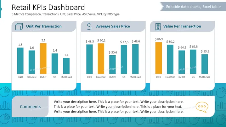
La diapositiva ofrece una comparación de tres KPIs retail por tipo de POS: Unidades Por Transacción (UPT), Precio Promedio de Venta (ASP) y Valor Por Transacción (VPT). UPT muestra el número promedio de unidades vendidas por transacción, destacando Outlet como la categoría líder. ASP compara el precio promedio al que se venden los bienes, siendo Franchise la que tiene la cifra más alta. VPT mide el valor monetario de las transacciones, con O&O siendo el mejor rendimiento.
El aspecto general es moderno y organizado, facilitando la interpretación de datos y la presentación atractiva. Los íconos y colores ayudan a distinguir rápidamente cada área de enfoque del KPI.



