Your graphics add a nice touch to my presentations and I recently used them for one of my all-hands meetings. Your toolbox adds professionalism to my slides. Instead of using standard clipart.
Claude Jones, Director of Engineer, @Walmartlabs, USA
Your graphics add a nice touch to my presentations and I recently used them for one of my all-hands meetings. Your toolbox adds professionalism to my slides. Instead of using standard clipart.
Claude Jones, Director of Engineer, @Walmartlabs, USA
I needed a fresh look at some of my slides. I've tried to find a way to create a paintbrush effect, to underline, accentuate, add some color and the handwritten markers were just the things. Very easy to use, easy to size, change the color. It was an affordable, perfect solution and I'm happy to recommend it.
Anonymous, US
The crisp, clean look of the graphics, and the fact that it allowed me to easily edit and change the colors to match the template was my main reason for purchasing them.
Brandie Jenkins, E-learning Developer, USA
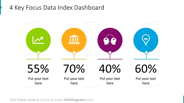
La diapositiva de PowerPoint presenta el "Tablero del Índice de Datos Clave 4", mostrando cuatro métricas críticas, cada una con un círculo de color distinto, una representación icónica y un valor porcentual. El primer ícono en verde representa el crecimiento, sugiriendo un rendimiento o métrica financiera del 55%. El segundo ícono en naranja muestra un edificio bancario, indicando una métrica de estabilidad financiera o inversión del 70%. El tercero en morado tiene dos cabezas con engranajes, representando la colaboración o el capital intelectual del 40%. El ícono final en azul exhibe una bombilla, simbolizando la innovación o las ideas del 60%. Cada métrica también tiene un espacio reservado para texto explicativo adicional.


