

Your graphics add a nice touch to my presentations and I recently used them for one of my all-hands meetings. Your toolbox adds professionalism to my slides. Instead of using standard clipart.
Claude Jones, Director of Engineer, @Walmartlabs, USA

Your graphics add a nice touch to my presentations and I recently used them for one of my all-hands meetings. Your toolbox adds professionalism to my slides. Instead of using standard clipart.
Claude Jones, Director of Engineer, @Walmartlabs, USA
I needed a fresh look at some of my slides. I've tried to find a way to create a paintbrush effect, to underline, accentuate, add some color and the handwritten markers were just the things. Very easy to use, easy to size, change the color. It was an affordable, perfect solution and I'm happy to recommend it.
Anonymous, US
The crisp, clean look of the graphics, and the fact that it allowed me to easily edit and change the colors to match the template was my main reason for purchasing them.
Brandie Jenkins, E-learning Developer, USA
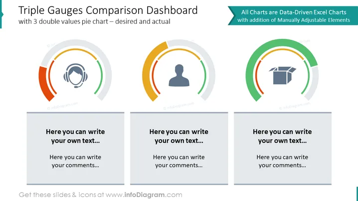
La diapositiva presenta un "Panel de Comparación de Medidores Triples" con tres medidores semicirculares que representan una comparación entre valores deseados y reales. Cada medidor tiene dos segmentos que indican niveles de progreso o logro. Los medidores vienen acompañados de cuadros de texto abajo donde se puede ingresar comentarios o descripciones relevantes. Estos medidores son útiles para visualizar métricas de rendimiento, logros de objetivos u otros resultados medibles. La etiqueta indica que los gráficos son impulsados por datos de Excel y se pueden ajustar manualmente según sea necesario.
El aspecto general de la diapositiva es profesional y limpio, con un enfoque en los medidores visuales que están diseñados para una fácil interpretación de datos. El uso del color no solo diferencia entre los medidores, sino que también añade una jerarquía visual a la información presentada.



