Your graphics add a nice touch to my presentations and I recently used them for one of my all-hands meetings. Your toolbox adds professionalism to my slides. Instead of using standard clipart.
Claude Jones, Director of Engineer, @Walmartlabs, USA
Your graphics add a nice touch to my presentations and I recently used them for one of my all-hands meetings. Your toolbox adds professionalism to my slides. Instead of using standard clipart.
Claude Jones, Director of Engineer, @Walmartlabs, USA
I needed a fresh look at some of my slides. I've tried to find a way to create a paintbrush effect, to underline, accentuate, add some color and the handwritten markers were just the things. Very easy to use, easy to size, change the color. It was an affordable, perfect solution and I'm happy to recommend it.
Anonymous, US
The crisp, clean look of the graphics, and the fact that it allowed me to easily edit and change the colors to match the template was my main reason for purchasing them.
Brandie Jenkins, E-learning Developer, USA
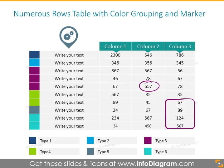
La diapositiva muestra una tabla para la clasificación de datos con filas codificadas por colores que indican diferentes grupos o categorías. Cada fila tiene espacios reservados para texto, y las columnas están etiquetadas como "Columna 1," "Columna 2," y "Columna 3," con datos numéricos. Algunos números están enmarcados para resaltar puntos de datos específicos. Debajo de la tabla, hay una leyenda que relaciona colores con tipos, como "Tipo 1," "Tipo 3," y así sucesivamente, indicando un sistema para clasificar los datos en la tabla de acuerdo a diferentes criterios o categorías.
La diapositiva tiene un aspecto limpio y profesional, con un esquema de color simple para diferenciar las categorías de datos. El uso de círculos para resaltar puntos de datos específicos atrae la atención del espectador de manera efectiva.


