Your graphics add a nice touch to my presentations and I recently used them for one of my all-hands meetings. Your toolbox adds professionalism to my slides. Instead of using standard clipart.
Claude Jones, Director of Engineer, @Walmartlabs, USA
Your graphics add a nice touch to my presentations and I recently used them for one of my all-hands meetings. Your toolbox adds professionalism to my slides. Instead of using standard clipart.
Claude Jones, Director of Engineer, @Walmartlabs, USA
I needed a fresh look at some of my slides. I've tried to find a way to create a paintbrush effect, to underline, accentuate, add some color and the handwritten markers were just the things. Very easy to use, easy to size, change the color. It was an affordable, perfect solution and I'm happy to recommend it.
Anonymous, US
The crisp, clean look of the graphics, and the fact that it allowed me to easily edit and change the colors to match the template was my main reason for purchasing them.
Brandie Jenkins, E-learning Developer, USA
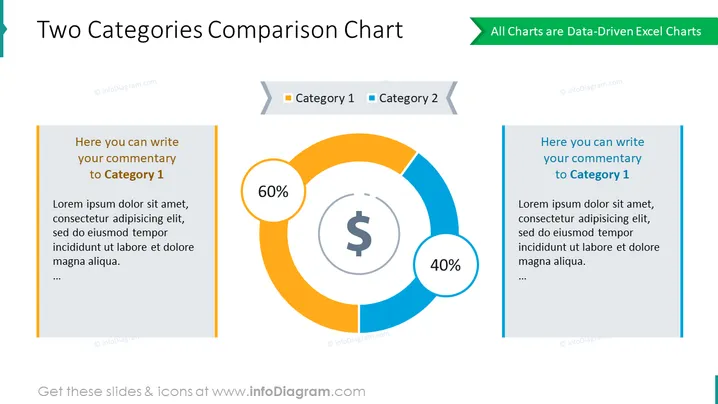
Esta diapositiva compara dos categorías en un gráfico circular que muestra la participación porcentual. Úsalo para presentar las proporciones con visuales brillantes y atractivos. Agrega tus descripciones a los lados para explicar los resultados a tu audiencia. Este diagrama está impulsado por datos de Excel, lo que te permite manipular el resultado rápidamente.
Esta Plantilla de Estadísticas del Gráfico de Comparación para 2 Categorías es parte de nuestro Template de Gráficos de Datos Basados en Gráficos de Pastel y Donas.


