

Your graphics add a nice touch to my presentations and I recently used them for one of my all-hands meetings. Your toolbox adds professionalism to my slides. Instead of using standard clipart.
Claude Jones, Director of Engineer, @Walmartlabs, USA

Your graphics add a nice touch to my presentations and I recently used them for one of my all-hands meetings. Your toolbox adds professionalism to my slides. Instead of using standard clipart.
Claude Jones, Director of Engineer, @Walmartlabs, USA
I needed a fresh look at some of my slides. I've tried to find a way to create a paintbrush effect, to underline, accentuate, add some color and the handwritten markers were just the things. Very easy to use, easy to size, change the color. It was an affordable, perfect solution and I'm happy to recommend it.
Anonymous, US
The crisp, clean look of the graphics, and the fact that it allowed me to easily edit and change the colors to match the template was my main reason for purchasing them.
Brandie Jenkins, E-learning Developer, USA
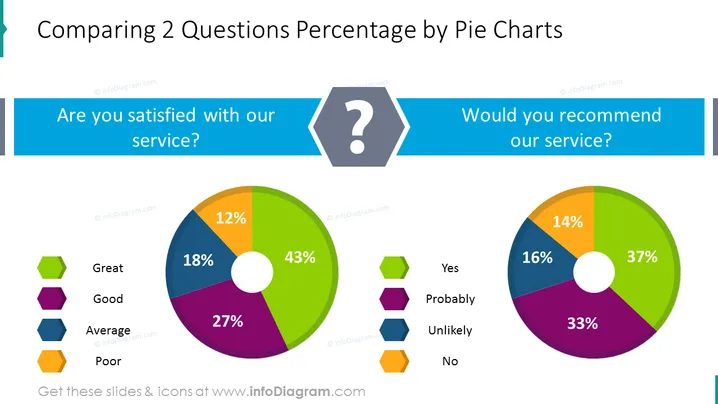
El Gráfico de Pastel de Comparación de Preguntas es una plantilla de PowerPoint fácil de editar y autoexplicativa que puedes usar para comparar tus preguntas con datos porcentuales. Una diapositiva de gráfico de pastel que compara dos preguntas de encuestas con secciones coloridas y una leyenda clara te ayudará a profundizar en esas preguntas y te facilitará resaltar ciertas partes o porcentajes sobre ellas.
Esta diapositiva de Gráfico de Pastel de Comparación de Preguntas es parte de nuestras Gráficas de Presentación del Informe de Encuesta.



