Your graphics add a nice touch to my presentations and I recently used them for one of my all-hands meetings. Your toolbox adds professionalism to my slides. Instead of using standard clipart.
Claude Jones, Director of Engineer, @Walmartlabs, USA
Your graphics add a nice touch to my presentations and I recently used them for one of my all-hands meetings. Your toolbox adds professionalism to my slides. Instead of using standard clipart.
Claude Jones, Director of Engineer, @Walmartlabs, USA
I needed a fresh look at some of my slides. I've tried to find a way to create a paintbrush effect, to underline, accentuate, add some color and the handwritten markers were just the things. Very easy to use, easy to size, change the color. It was an affordable, perfect solution and I'm happy to recommend it.
Anonymous, US
The crisp, clean look of the graphics, and the fact that it allowed me to easily edit and change the colors to match the template was my main reason for purchasing them.
Brandie Jenkins, E-learning Developer, USA
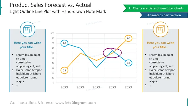
Utiliza este diagrama comparativo para discutir los datos de ventas de productos reales y previstos a lo largo de los años. Es una versión animada de una diapositiva que te permite añadir algo de vida a tu presentación. Marca cualquier punto en este gráfico de líneas impulsado por datos de Excel con nuestra forma editable de garabato y añade tus descripciones en los lados.
Este Gráfico Comparativo: Diagrama de Ventas de Productos Previstas vs Reales es parte de nuestra Plantilla PPT de Gráficos Impulsados por Datos de Gráfico de Líneas.


