

Your graphics add a nice touch to my presentations and I recently used them for one of my all-hands meetings. Your toolbox adds professionalism to my slides. Instead of using standard clipart.
Claude Jones, Director of Engineer, @Walmartlabs, USA

Your graphics add a nice touch to my presentations and I recently used them for one of my all-hands meetings. Your toolbox adds professionalism to my slides. Instead of using standard clipart.
Claude Jones, Director of Engineer, @Walmartlabs, USA
I needed a fresh look at some of my slides. I've tried to find a way to create a paintbrush effect, to underline, accentuate, add some color and the handwritten markers were just the things. Very easy to use, easy to size, change the color. It was an affordable, perfect solution and I'm happy to recommend it.
Anonymous, US
The crisp, clean look of the graphics, and the fact that it allowed me to easily edit and change the colors to match the template was my main reason for purchasing them.
Brandie Jenkins, E-learning Developer, USA
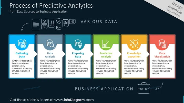
La diapositiva de PowerPoint describe los pasos secuenciales en el proceso de análisis predictivo, comenzando desde la recolección de datos, que implica recopilar datos de diversas fuentes, hasta el análisis de datos, que es la examen e interpretación de esos datos. Preparar datos se refiere a limpiar y estructurar datos para el análisis, mientras que el análisis predictivo utiliza técnicas estadísticas para prever resultados. La extracción de conocimiento se trata de derivar insights accionables, y la visualización de datos es la representación gráfica de los datos, concluyendo el proceso antes de aplicar estos insights en el negocio.



