Your graphics add a nice touch to my presentations and I recently used them for one of my all-hands meetings. Your toolbox adds professionalism to my slides. Instead of using standard clipart.
Claude Jones, Director of Engineer, @Walmartlabs, USA
Your graphics add a nice touch to my presentations and I recently used them for one of my all-hands meetings. Your toolbox adds professionalism to my slides. Instead of using standard clipart.
Claude Jones, Director of Engineer, @Walmartlabs, USA
I needed a fresh look at some of my slides. I've tried to find a way to create a paintbrush effect, to underline, accentuate, add some color and the handwritten markers were just the things. Very easy to use, easy to size, change the color. It was an affordable, perfect solution and I'm happy to recommend it.
Anonymous, US
The crisp, clean look of the graphics, and the fact that it allowed me to easily edit and change the colors to match the template was my main reason for purchasing them.
Brandie Jenkins, E-learning Developer, USA
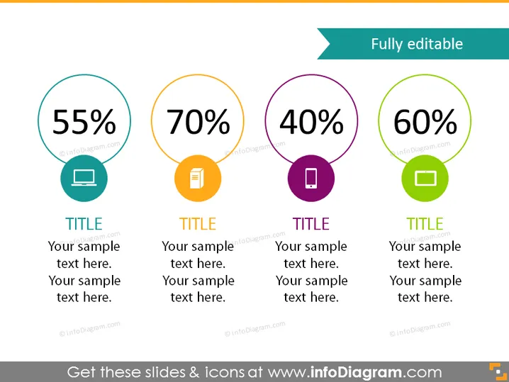
La diapositiva de PowerPoint presenta cuatro elementos infográficos circulares distintos, cada uno con un valor porcentual diferente: 55%, 70%, 40% y 60%. Parecen estar diseñados para mostrar datos estadísticos o niveles de progreso. Cada porcentaje va acompañado de un ícono y de un marcador titulado "TÍTULO" seguido de marcadores de texto de muestra para más explicaciones o detalles sobre la estadística o el tema representado por el porcentaje correspondiente y su ícono.
El aspecto general es limpio y moderno, con un enfoque en elementos infográficos audaces y coloridos que atraen la atención hacia los puntos de datos clave. Utiliza efectivamente el color y la tipografía para guiar la mirada de la audiencia y resaltar la información.


