Your graphics add a nice touch to my presentations and I recently used them for one of my all-hands meetings. Your toolbox adds professionalism to my slides. Instead of using standard clipart.
Claude Jones, Director of Engineer, @Walmartlabs, USA
Your graphics add a nice touch to my presentations and I recently used them for one of my all-hands meetings. Your toolbox adds professionalism to my slides. Instead of using standard clipart.
Claude Jones, Director of Engineer, @Walmartlabs, USA
I needed a fresh look at some of my slides. I've tried to find a way to create a paintbrush effect, to underline, accentuate, add some color and the handwritten markers were just the things. Very easy to use, easy to size, change the color. It was an affordable, perfect solution and I'm happy to recommend it.
Anonymous, US
The crisp, clean look of the graphics, and the fact that it allowed me to easily edit and change the colors to match the template was my main reason for purchasing them.
Brandie Jenkins, E-learning Developer, USA
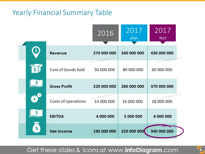
La diapositiva presenta un resumen financiero comparativo para los años 2016 y 2017, incluyendo cifras planificadas versus reales para 2017. Compara los Ingresos, Costo de Bienes Vendidos, Ganancia Bruta, Costos de operación, EBITDA y Utilidad Neta en tres columnas. Cada métrica financiera muestra un aumento significativo en las cifras reales de 2017 en comparación con los planes de 2016 y 2017, lo que indica crecimiento y quizás superación de las proyecciones. La Ganancia Bruta aumentó de 220 millones en 2016 a 370 millones en 2017 real, mostrando una gestión efectiva de ingresos. También se destacan las métricas de EBITDA y Utilidad Neta, con cifras reales de 2017 que superan el plan; particularmente, la Utilidad Neta vio un salto a 340 millones, rodeado para enfatizar su importancia.


