Your graphics add a nice touch to my presentations and I recently used them for one of my all-hands meetings. Your toolbox adds professionalism to my slides. Instead of using standard clipart.
Claude Jones, Director of Engineer, @Walmartlabs, USA
Your graphics add a nice touch to my presentations and I recently used them for one of my all-hands meetings. Your toolbox adds professionalism to my slides. Instead of using standard clipart.
Claude Jones, Director of Engineer, @Walmartlabs, USA
I needed a fresh look at some of my slides. I've tried to find a way to create a paintbrush effect, to underline, accentuate, add some color and the handwritten markers were just the things. Very easy to use, easy to size, change the color. It was an affordable, perfect solution and I'm happy to recommend it.
Anonymous, US
The crisp, clean look of the graphics, and the fact that it allowed me to easily edit and change the colors to match the template was my main reason for purchasing them.
Brandie Jenkins, E-learning Developer, USA
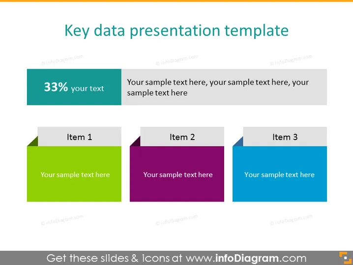
La diapositiva se titula "Plantilla de Presentación de Datos Clave" y parece presentar un método para mostrar puntos de datos clave o métricas de progreso en un formato visual. Hay tres gráficos en forma de cuadrados de colores, cada uno con un encabezado "Elemento 1," "Elemento 2," y "Elemento 3," lo que sugiere un lugar para ingresar puntos de datos o conceptos individuales. Cada uno de estos está acompañado de un texto de marcador de posición que indica dónde agregar texto descriptivo. Además, a la izquierda, un rectángulo de color teal indica "33%" con un subtítulo "tu texto," lo que implica un espacio para una estadística o cifra clave con detalles relacionados.
La diapositiva de PowerPoint exhibe un diseño profesional y limpio. El uso de colores degradados y la separación distinta de los elementos aseguran claridad y atractivo visual.


