Your graphics add a nice touch to my presentations and I recently used them for one of my all-hands meetings. Your toolbox adds professionalism to my slides. Instead of using standard clipart.
Claude Jones, Director of Engineer, @Walmartlabs, USA
Your graphics add a nice touch to my presentations and I recently used them for one of my all-hands meetings. Your toolbox adds professionalism to my slides. Instead of using standard clipart.
Claude Jones, Director of Engineer, @Walmartlabs, USA
I needed a fresh look at some of my slides. I've tried to find a way to create a paintbrush effect, to underline, accentuate, add some color and the handwritten markers were just the things. Very easy to use, easy to size, change the color. It was an affordable, perfect solution and I'm happy to recommend it.
Anonymous, US
The crisp, clean look of the graphics, and the fact that it allowed me to easily edit and change the colors to match the template was my main reason for purchasing them.
Brandie Jenkins, E-learning Developer, USA
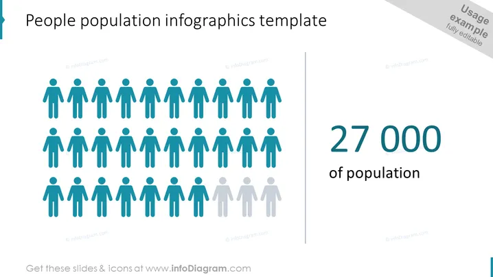
La diapositiva es una representación visual de datos de población, que muestra filas de figuras humanas de género neutral en azul para significar un segmento específico de la población. Las figuras están parcialmente desvanecidas hacia la fila inferior, sugiriendo representación estadística, mientras que el lado derecho presenta el número 27,000 en una fuente grande color teal, enfatizando la cantidad dentro del contexto de la población.
El aspecto general de la diapositiva es profesional y visualmente claro, con un uso intencionado del color y el diseño para presentar datos de manera efectiva. La iconografía y el tamaño del texto crean una jerarquía visual que guía la atención del espectador desde el gráfico hasta el texto.


