Your graphics add a nice touch to my presentations and I recently used them for one of my all-hands meetings. Your toolbox adds professionalism to my slides. Instead of using standard clipart.
Claude Jones, Director of Engineer, @Walmartlabs, USA
Your graphics add a nice touch to my presentations and I recently used them for one of my all-hands meetings. Your toolbox adds professionalism to my slides. Instead of using standard clipart.
Claude Jones, Director of Engineer, @Walmartlabs, USA
I needed a fresh look at some of my slides. I've tried to find a way to create a paintbrush effect, to underline, accentuate, add some color and the handwritten markers were just the things. Very easy to use, easy to size, change the color. It was an affordable, perfect solution and I'm happy to recommend it.
Anonymous, US
The crisp, clean look of the graphics, and the fact that it allowed me to easily edit and change the colors to match the template was my main reason for purchasing them.
Brandie Jenkins, E-learning Developer, USA
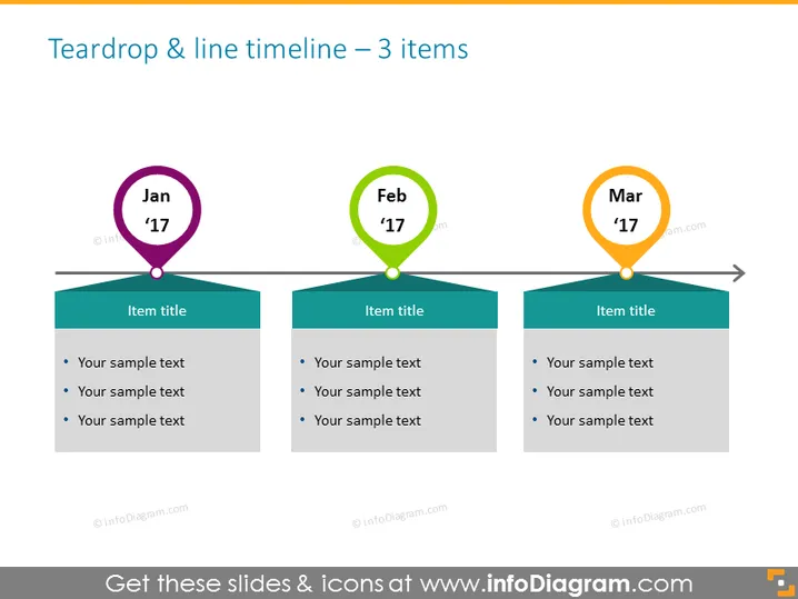
La diapositiva muestra una línea de tiempo horizontal con tres hitos clave, cada uno representado por una forma de gota de color contrastante y una etiqueta correspondiente de mes y año: ene '17, feb '17 y mar '17. Debajo de cada gota hay un banner con el texto de marcador de posición "Título del elemento," que sugiere dónde se puede insertar un título específico de un evento o hito. Debajo de cada título hay puntos de viñeta para detalles adicionales: tres líneas de texto de muestra indican dónde se puede explicar más información sobre cada hito.
La apariencia general de la diapositiva es limpia, moderna y fácil de seguir. El uso de colores brillantes y formas distintivas atrae efectivamente la atención del espectador hacia cada evento de la línea de tiempo.


