Your graphics add a nice touch to my presentations and I recently used them for one of my all-hands meetings. Your toolbox adds professionalism to my slides. Instead of using standard clipart.
Claude Jones, Director of Engineer, @Walmartlabs, USA
Your graphics add a nice touch to my presentations and I recently used them for one of my all-hands meetings. Your toolbox adds professionalism to my slides. Instead of using standard clipart.
Claude Jones, Director of Engineer, @Walmartlabs, USA
I needed a fresh look at some of my slides. I've tried to find a way to create a paintbrush effect, to underline, accentuate, add some color and the handwritten markers were just the things. Very easy to use, easy to size, change the color. It was an affordable, perfect solution and I'm happy to recommend it.
Anonymous, US
The crisp, clean look of the graphics, and the fact that it allowed me to easily edit and change the colors to match the template was my main reason for purchasing them.
Brandie Jenkins, E-learning Developer, USA
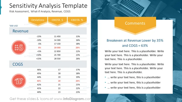
La diapositiva titulada "Plantilla de Análisis de Sensibilidad" analiza la evaluación de riesgos y el análisis hipotético, centrándose en los ingresos y el COGS (Costo de Bienes Vendidos). Presenta dos secciones principales de datos:
Debajo de cada sección, hay iconos ilustrativos. Una sección de "Comentarios" describe un escenario específico, el punto de equilibrio con un ingreso inferior del 35% y un COGS del 63%.
La diapositiva tiene un diseño profesional y simplificado con un enfoque claro en los datos financieros. El uso de iconos y resaltados de color llama la atención sobre elementos clave sin abrumar al espectador.


