Your graphics add a nice touch to my presentations and I recently used them for one of my all-hands meetings. Your toolbox adds professionalism to my slides. Instead of using standard clipart.
Claude Jones, Director of Engineer, @Walmartlabs, USA
Your graphics add a nice touch to my presentations and I recently used them for one of my all-hands meetings. Your toolbox adds professionalism to my slides. Instead of using standard clipart.
Claude Jones, Director of Engineer, @Walmartlabs, USA
I needed a fresh look at some of my slides. I've tried to find a way to create a paintbrush effect, to underline, accentuate, add some color and the handwritten markers were just the things. Very easy to use, easy to size, change the color. It was an affordable, perfect solution and I'm happy to recommend it.
Anonymous, US
The crisp, clean look of the graphics, and the fact that it allowed me to easily edit and change the colors to match the template was my main reason for purchasing them.
Brandie Jenkins, E-learning Developer, USA
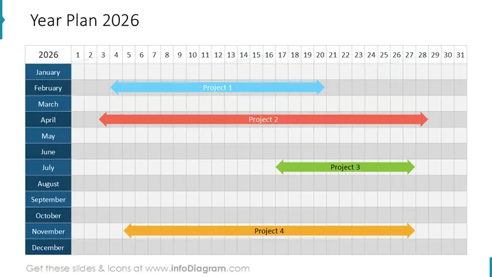
La diapositiva presenta un plan anual para 2026, que involucra cuatro proyectos dispuestos en un gráfico tipo Gantt. El Proyecto 1 se extiende de febrero a junio, utilizando una flecha azul para indicar su duración y dirección. El Proyecto 2, representado por una flecha roja, se extiende de abril a octubre, mientras que el Proyecto 3, mostrado con una flecha verde, tiene lugar de julio a septiembre. Por último, el Proyecto 4 está marcado por una flecha amarilla, que cubre noviembre y diciembre. Cada flecha de proyecto incluye una etiqueta con su número respectivo.
El aspecto general de la diapositiva es profesional y limpio, con un buen uso de colores y sombras contrastantes para distinguir entre meses y proyectos. Es visualmente atractiva y comunica de inmediato el concepto de programación y gestión del tiempo a través de su estructura similar a un diagrama de Gantt.


