Your graphics add a nice touch to my presentations and I recently used them for one of my all-hands meetings. Your toolbox adds professionalism to my slides. Instead of using standard clipart.
Claude Jones, Director of Engineer, @Walmartlabs, USA
Your graphics add a nice touch to my presentations and I recently used them for one of my all-hands meetings. Your toolbox adds professionalism to my slides. Instead of using standard clipart.
Claude Jones, Director of Engineer, @Walmartlabs, USA
I needed a fresh look at some of my slides. I've tried to find a way to create a paintbrush effect, to underline, accentuate, add some color and the handwritten markers were just the things. Very easy to use, easy to size, change the color. It was an affordable, perfect solution and I'm happy to recommend it.
Anonymous, US
The crisp, clean look of the graphics, and the fact that it allowed me to easily edit and change the colors to match the template was my main reason for purchasing them.
Brandie Jenkins, E-learning Developer, USA
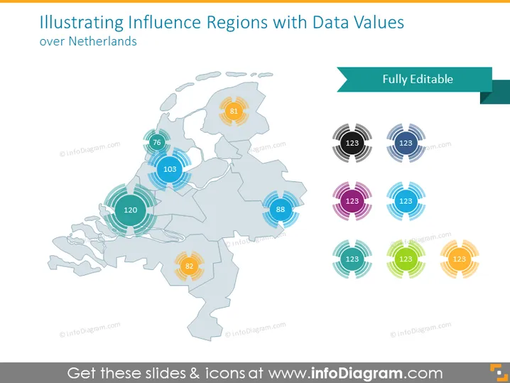
La diapositiva muestra un mapa de los Países Bajos acompañado de valores de datos que representan regiones de influencia. Cada región está destacada con un gráfico circular y un número dentro, sugiriendo algún tipo de métrica cuantificable. Esto podría denotar diversos datos regionales como población, volumen de ventas u otras estadísticas medibles. La presencia de múltiples colores para los gráficos circulares indica que diferentes categorías o tipos de datos podrían estar representados en esta diapositiva.
La diapositiva tiene una estética limpia y profesional con una paleta de colores que es agradable a la vista y no abrumadora. El diseño es claro, utilizando tanto el color como los datos numéricos para presentar información de manera efectiva.


