Your graphics add a nice touch to my presentations and I recently used them for one of my all-hands meetings. Your toolbox adds professionalism to my slides. Instead of using standard clipart.
Claude Jones, Director of Engineer, @Walmartlabs, USA
Your graphics add a nice touch to my presentations and I recently used them for one of my all-hands meetings. Your toolbox adds professionalism to my slides. Instead of using standard clipart.
Claude Jones, Director of Engineer, @Walmartlabs, USA
I needed a fresh look at some of my slides. I've tried to find a way to create a paintbrush effect, to underline, accentuate, add some color and the handwritten markers were just the things. Very easy to use, easy to size, change the color. It was an affordable, perfect solution and I'm happy to recommend it.
Anonymous, US
The crisp, clean look of the graphics, and the fact that it allowed me to easily edit and change the colors to match the template was my main reason for purchasing them.
Brandie Jenkins, E-learning Developer, USA
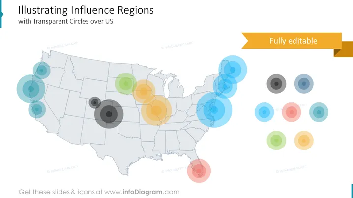
La diapositiva de PowerPoint presenta un concepto titulado "Ilustrando Regiones de Influencia con Círculos Transparentes sobre EE. UU.", que muestra varios grados de influencia en diferentes regiones de los Estados Unidos a través de una serie de círculos transparentes superpuestos. Los diferentes tamaños de los círculos probablemente representan las diferentes magnitudes o intensidades de influencia, siendo los círculos más grandes los que denotan una influencia más significativa y los círculos más pequeños los que indican una influencia menor. Cada grupo de círculos puede correlacionarse con un tema o métrica específica, comunicando cómo se difunde la influencia geográficamente.
La diapositiva tiene una sensación minimalista y profesional con su uso de transparencia y color para representar datos complejos de manera visualmente accesible. La composición atrae efectivamente la atención hacia regiones de interés sin abrumar al espectador con detalles o texto excesivos.


