Your graphics add a nice touch to my presentations and I recently used them for one of my all-hands meetings. Your toolbox adds professionalism to my slides. Instead of using standard clipart.
Claude Jones, Director of Engineer, @Walmartlabs, USA
Your graphics add a nice touch to my presentations and I recently used them for one of my all-hands meetings. Your toolbox adds professionalism to my slides. Instead of using standard clipart.
Claude Jones, Director of Engineer, @Walmartlabs, USA
I needed a fresh look at some of my slides. I've tried to find a way to create a paintbrush effect, to underline, accentuate, add some color and the handwritten markers were just the things. Very easy to use, easy to size, change the color. It was an affordable, perfect solution and I'm happy to recommend it.
Anonymous, US
The crisp, clean look of the graphics, and the fact that it allowed me to easily edit and change the colors to match the template was my main reason for purchasing them.
Brandie Jenkins, E-learning Developer, USA
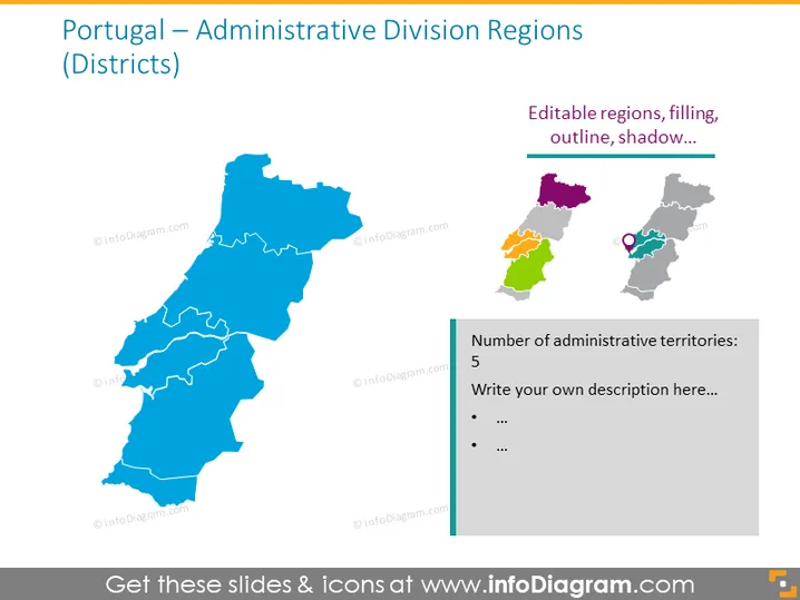
La diapositiva se centra en las regiones de división administrativa de Portugal, mostrando sus distritos. El gráfico principal es un mapa de Portugal dividido en distritos, resaltado y codificado por colores para diferenciar entre las diversas áreas administrativas. Un recuadro titulado "Regiones editables, relleno, contorno, sombra..." sugiere que los aspectos visuales del mapa son personalizables. Además, hay una sección de notas con "Número de territorios administrativos: 5" que invita al usuario a detallar más información o descripciones relacionadas con los distritos.
La diapositiva está visualmente equilibrada con una imagen central dominante y elementos adicionales dispuestos metódicamente al lado. El uso del color resalta las distintas regiones del mapa mientras proporciona una estética profesional y limpia.


