Your graphics add a nice touch to my presentations and I recently used them for one of my all-hands meetings. Your toolbox adds professionalism to my slides. Instead of using standard clipart.
Claude Jones, Director of Engineer, @Walmartlabs, USA
Your graphics add a nice touch to my presentations and I recently used them for one of my all-hands meetings. Your toolbox adds professionalism to my slides. Instead of using standard clipart.
Claude Jones, Director of Engineer, @Walmartlabs, USA
I needed a fresh look at some of my slides. I've tried to find a way to create a paintbrush effect, to underline, accentuate, add some color and the handwritten markers were just the things. Very easy to use, easy to size, change the color. It was an affordable, perfect solution and I'm happy to recommend it.
Anonymous, US
The crisp, clean look of the graphics, and the fact that it allowed me to easily edit and change the colors to match the template was my main reason for purchasing them.
Brandie Jenkins, E-learning Developer, USA
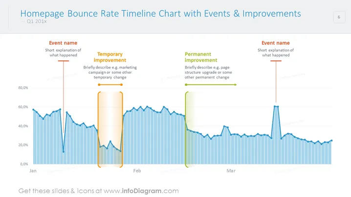
Gráfico de línea de tiempo de PowerPoint adecuado para un análisis profundo de la tasa de rebote de la página de inicio, incluidos eventos importantes, mejoras temporales y mejoras permanentes. Ilustra el comportamiento de los usuarios durante los meses siguientes y anota cambios esenciales para discutir con tu equipo o clientes.
Este Gráfico de Línea de Tiempo de la Tasa de Rebote con Eventos y Mejoras Deslizante es parte de nuestra Plantilla PPT de Gráficos de Informes de Análisis Web.


