Your graphics add a nice touch to my presentations and I recently used them for one of my all-hands meetings. Your toolbox adds professionalism to my slides. Instead of using standard clipart.
Claude Jones, Director of Engineer, @Walmartlabs, USA
Your graphics add a nice touch to my presentations and I recently used them for one of my all-hands meetings. Your toolbox adds professionalism to my slides. Instead of using standard clipart.
Claude Jones, Director of Engineer, @Walmartlabs, USA
I needed a fresh look at some of my slides. I've tried to find a way to create a paintbrush effect, to underline, accentuate, add some color and the handwritten markers were just the things. Very easy to use, easy to size, change the color. It was an affordable, perfect solution and I'm happy to recommend it.
Anonymous, US
The crisp, clean look of the graphics, and the fact that it allowed me to easily edit and change the colors to match the template was my main reason for purchasing them.
Brandie Jenkins, E-learning Developer, USA
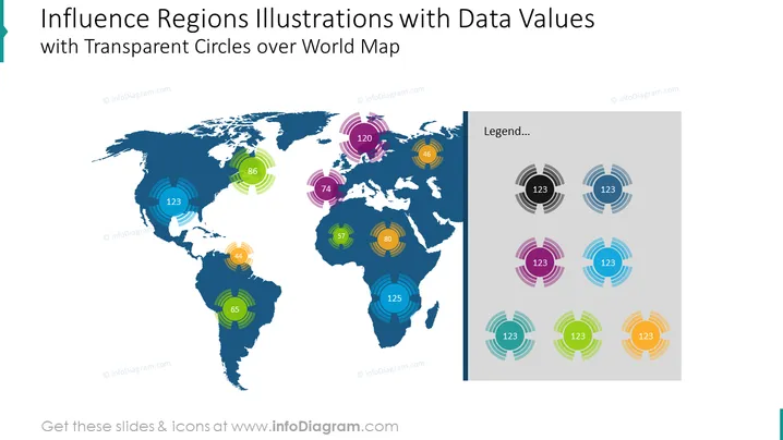
El contenido de la diapositiva de la plantilla Ilustraciones de Regiones de Influencia con Valores de Datos se utiliza cuando deseas representar visualmente y comparar datos a través de diferentes regiones o países del mundo. Hemos agregado una leyenda para explicar el significado de los círculos coloridos que representan los valores de datos. Todas las formas son vectores, por lo que puedes jugar con los colores y redimensionar los elementos sin perder calidad. Puedes descargar esta plantilla PPT en Google Slides y Keynote.
Infografías de la diapositiva: Fondo Blanco, Cuadro de Texto, Círculos Transparentes Coloridos, Infografía del Mapa Mundial.


