Your graphics add a nice touch to my presentations and I recently used them for one of my all-hands meetings. Your toolbox adds professionalism to my slides. Instead of using standard clipart.
Claude Jones, Director of Engineer, @Walmartlabs, USA
Your graphics add a nice touch to my presentations and I recently used them for one of my all-hands meetings. Your toolbox adds professionalism to my slides. Instead of using standard clipart.
Claude Jones, Director of Engineer, @Walmartlabs, USA
I needed a fresh look at some of my slides. I've tried to find a way to create a paintbrush effect, to underline, accentuate, add some color and the handwritten markers were just the things. Very easy to use, easy to size, change the color. It was an affordable, perfect solution and I'm happy to recommend it.
Anonymous, US
The crisp, clean look of the graphics, and the fact that it allowed me to easily edit and change the colors to match the template was my main reason for purchasing them.
Brandie Jenkins, E-learning Developer, USA
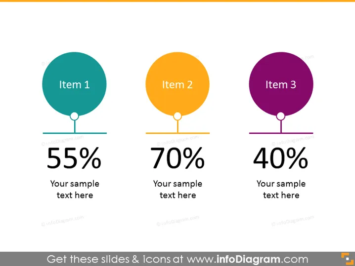
La diapositiva de PowerPoint muestra tres elementos clave, cada uno asociado a un color distinto, un porcentaje y un espacio para texto descriptivo. "Elemento 1" está emparejado con "55%", "Elemento 2" con "70%" y "Elemento 3" con "40%". Esto indica un análisis comparativo, donde cada elemento probablemente representa un aspecto diferente que se mide, con los porcentajes reflejando niveles de finalización, satisfacción u otra métrica.
La diapositiva utiliza un diseño limpio y minimalista con un fondo neutral que hace que los elementos coloridos resalten. El énfasis visual en las cifras porcentuales indica su importancia en el mensaje de la diapositiva.


