Your graphics add a nice touch to my presentations and I recently used them for one of my all-hands meetings. Your toolbox adds professionalism to my slides. Instead of using standard clipart.
Claude Jones, Director of Engineer, @Walmartlabs, USA
Your graphics add a nice touch to my presentations and I recently used them for one of my all-hands meetings. Your toolbox adds professionalism to my slides. Instead of using standard clipart.
Claude Jones, Director of Engineer, @Walmartlabs, USA
I needed a fresh look at some of my slides. I've tried to find a way to create a paintbrush effect, to underline, accentuate, add some color and the handwritten markers were just the things. Very easy to use, easy to size, change the color. It was an affordable, perfect solution and I'm happy to recommend it.
Anonymous, US
The crisp, clean look of the graphics, and the fact that it allowed me to easily edit and change the colors to match the template was my main reason for purchasing them.
Brandie Jenkins, E-learning Developer, USA
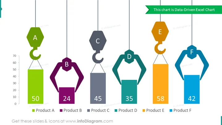
La diapositiva presenta un gráfico de Excel impulsado por datos que compara seis productos diferentes, etiquetados de A a F. Cada producto está representado por un gráfico de barras elevado por ganchos de grúa, con alturas variadas para significar visualmente los diferentes valores que cada producto ha alcanzado. Los valores varían de 24 para el Producto B (el más bajo) a 58 para el Producto E (el más alto), con cada barra etiquetada con un número distintivo y en negrita que refleja el valor y una letra mayúscula que representa el producto. La diapositiva comunica efectivamente mediciones cuantitativas de una manera visualmente atractiva.
La diapositiva tiene un diseño limpio y moderno con un método de visualización creativo. Su diferenciación de color y etiquetado numérico la hacen fácil de leer de un vistazo.


