Your graphics add a nice touch to my presentations and I recently used them for one of my all-hands meetings. Your toolbox adds professionalism to my slides. Instead of using standard clipart.
Claude Jones, Director of Engineer, @Walmartlabs, USA
Your graphics add a nice touch to my presentations and I recently used them for one of my all-hands meetings. Your toolbox adds professionalism to my slides. Instead of using standard clipart.
Claude Jones, Director of Engineer, @Walmartlabs, USA
I needed a fresh look at some of my slides. I've tried to find a way to create a paintbrush effect, to underline, accentuate, add some color and the handwritten markers were just the things. Very easy to use, easy to size, change the color. It was an affordable, perfect solution and I'm happy to recommend it.
Anonymous, US
The crisp, clean look of the graphics, and the fact that it allowed me to easily edit and change the colors to match the template was my main reason for purchasing them.
Brandie Jenkins, E-learning Developer, USA
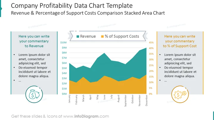
Este es un diseño de PowerPoint impulsado por Excel que contiene un gráfico de área apilada que presenta la comparación de ingresos y porcentaje de costos de soporte junto con secciones de comentarios para ambos factores. Muestra valores mensuales de dinero y porcentajes entre sí de una manera visual clara.
Este Gráfico de Datos de Rentabilidad de la Empresa con Valores y Diseño de Descripción es parte de nuestra Plantilla de PPT de Gráficos de Datos Financieros de la Empresa.


