Your graphics add a nice touch to my presentations and I recently used them for one of my all-hands meetings. Your toolbox adds professionalism to my slides. Instead of using standard clipart.
Claude Jones, Director of Engineer, @Walmartlabs, USA
Your graphics add a nice touch to my presentations and I recently used them for one of my all-hands meetings. Your toolbox adds professionalism to my slides. Instead of using standard clipart.
Claude Jones, Director of Engineer, @Walmartlabs, USA
I needed a fresh look at some of my slides. I've tried to find a way to create a paintbrush effect, to underline, accentuate, add some color and the handwritten markers were just the things. Very easy to use, easy to size, change the color. It was an affordable, perfect solution and I'm happy to recommend it.
Anonymous, US
The crisp, clean look of the graphics, and the fact that it allowed me to easily edit and change the colors to match the template was my main reason for purchasing them.
Brandie Jenkins, E-learning Developer, USA
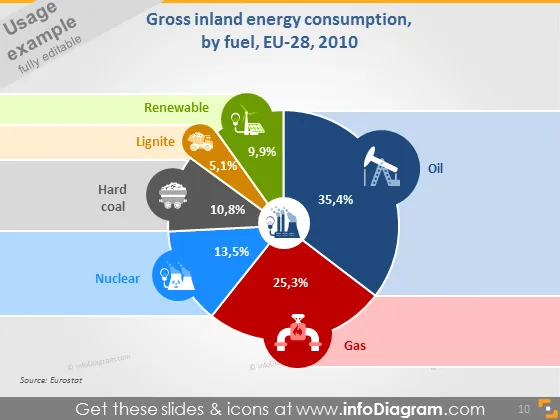
La diapositiva presenta datos sobre el consumo bruto de energía interior de la UE-28 en 2010 según el tipo de combustible. Las fuentes de energía renovable contribuyeron con un 9.9%, ligeramente por debajo del 10.8% del carbón duro. La lignito tuvo la menor participación con un 5.1%. La energía nuclear aportó un sustancial 13.5%, mientras que el gas fue responsable de un significativo 25.3% del consumo de energía. El petróleo fue el mayor contribuyente individual con un 35.4%, lo que indica su dominio en la mezcla energética durante ese año. Cada tipo de combustible también está representado por un ícono, mejorando el atractivo visual y haciendo que los datos sean más accesibles.
La diapositiva utiliza un diseño limpio y moderno con colores brillantes, haciendo que la información sea atractiva y fácil de leer. El uso de íconos y porcentajes directamente en los segmentos del gráfico circular permite una rápida comprensión de los datos.


