Your graphics add a nice touch to my presentations and I recently used them for one of my all-hands meetings. Your toolbox adds professionalism to my slides. Instead of using standard clipart.
Claude Jones, Director of Engineer, @Walmartlabs, USA
Your graphics add a nice touch to my presentations and I recently used them for one of my all-hands meetings. Your toolbox adds professionalism to my slides. Instead of using standard clipart.
Claude Jones, Director of Engineer, @Walmartlabs, USA
I needed a fresh look at some of my slides. I've tried to find a way to create a paintbrush effect, to underline, accentuate, add some color and the handwritten markers were just the things. Very easy to use, easy to size, change the color. It was an affordable, perfect solution and I'm happy to recommend it.
Anonymous, US
The crisp, clean look of the graphics, and the fact that it allowed me to easily edit and change the colors to match the template was my main reason for purchasing them.
Brandie Jenkins, E-learning Developer, USA
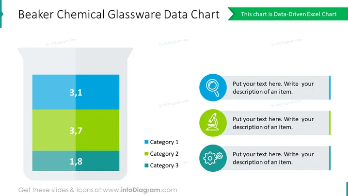
Este audaz diagrama presenta un gráfico de datos apilados impulsado por Excel, representado como un vaso de vidrio de laboratorio lleno de diferentes niveles de sustancias coloridas. Utiliza esta diapositiva para añadir un toque creativo a tu presentación o discutir resultados científicos. Edita todos los elementos de esta diapositiva fácilmente y ajusta el aspecto al resto de tu presentación en minutos.
Este diagrama de gráfico de datos de vidrio de laboratorio Beaker es parte de nuestra plantilla PPT de Gráficos de Tubos de Ensayo de Laboratorio Químico.


