
Your graphics add a nice touch to my presentations and I recently used them for one of my all-hands meetings. Your toolbox adds professionalism to my slides. Instead of using standard clipart.
Claude Jones, Director of Engineer, @Walmartlabs, USA

Your graphics add a nice touch to my presentations and I recently used them for one of my all-hands meetings. Your toolbox adds professionalism to my slides. Instead of using standard clipart.
Claude Jones, Director of Engineer, @Walmartlabs, USA

I needed a fresh look at some of my slides. I've tried to find a way to create a paintbrush effect, to underline, accentuate, add some color and the handwritten markers were just the things. Very easy to use, easy to size, change the color. It was an affordable, perfect solution and I'm happy to recommend it.
Anonymous, US
The crisp, clean look of the graphics, and the fact that it allowed me to easily edit and change the colors to match the template was my main reason for purchasing them.
Brandie Jenkins, E-learning Developer, USA
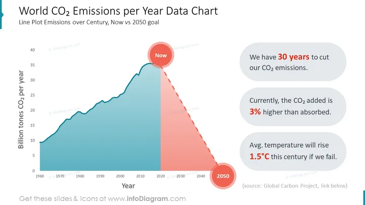
Esta diapositiva contiene un gráfico de líneas que presenta la meta de emisiones de CO2 para 2050, junto con datos históricos. El diagrama está acompañado de tres poderosas afirmaciones climáticas sobre la perspectiva de las emisiones de CO2, el balance de CO2 en la atmósfera y el pronóstico del aumento de temperatura.
Esta Diapositiva de Gráfica de Datos de Emisiones de CO2 por Año del Mundo es parte de nuestra Presentación PPT de Plantilla de Acciones Contra el Cambio Climático.


