Your graphics add a nice touch to my presentations and I recently used them for one of my all-hands meetings. Your toolbox adds professionalism to my slides. Instead of using standard clipart.
Claude Jones, Director of Engineer, @Walmartlabs, USA
Your graphics add a nice touch to my presentations and I recently used them for one of my all-hands meetings. Your toolbox adds professionalism to my slides. Instead of using standard clipart.
Claude Jones, Director of Engineer, @Walmartlabs, USA
I needed a fresh look at some of my slides. I've tried to find a way to create a paintbrush effect, to underline, accentuate, add some color and the handwritten markers were just the things. Very easy to use, easy to size, change the color. It was an affordable, perfect solution and I'm happy to recommend it.
Anonymous, US
The crisp, clean look of the graphics, and the fact that it allowed me to easily edit and change the colors to match the template was my main reason for purchasing them.
Brandie Jenkins, E-learning Developer, USA
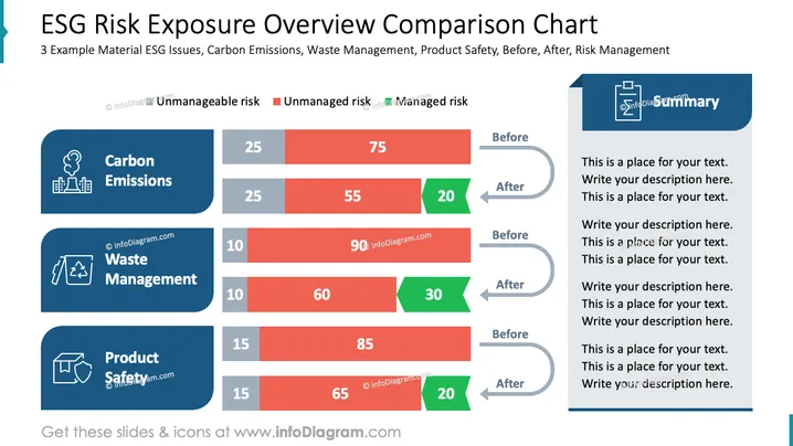
La diapositiva presenta una comparación de las exposiciones al riesgo ESG antes y después de las intervenciones de gestión de riesgos en tres áreas: Emisiones de Carbono, Gestión de Residuos y Seguridad del Producto. Cada área incluye un desglose de riesgos en tres categorías: Riesgos Incontrolables, Riesgos No Gestionados y Riesgos Gestionados. Las Emisiones de Carbono muestran un cambio del 75% de riesgo no gestionado al 20% de riesgo gestionado. La Gestión de Residuos reduce el riesgo no gestionado del 90% al 30%. La Seguridad del Producto disminuye el riesgo no gestionado del 85% al 20%, destacando las medidas de control de riesgo efectivas.
La diapositiva mantiene un diseño profesional y conciso, utilizando colores estratégicamente para enfatizar los cambios en los resultados de la gestión de riesgos. Equilibra efectivamente texto y gráficos.


