Your graphics add a nice touch to my presentations and I recently used them for one of my all-hands meetings. Your toolbox adds professionalism to my slides. Instead of using standard clipart.
Claude Jones, Director of Engineer, @Walmartlabs, USA
Your graphics add a nice touch to my presentations and I recently used them for one of my all-hands meetings. Your toolbox adds professionalism to my slides. Instead of using standard clipart.
Claude Jones, Director of Engineer, @Walmartlabs, USA
I needed a fresh look at some of my slides. I've tried to find a way to create a paintbrush effect, to underline, accentuate, add some color and the handwritten markers were just the things. Very easy to use, easy to size, change the color. It was an affordable, perfect solution and I'm happy to recommend it.
Anonymous, US
The crisp, clean look of the graphics, and the fact that it allowed me to easily edit and change the colors to match the template was my main reason for purchasing them.
Brandie Jenkins, E-learning Developer, USA
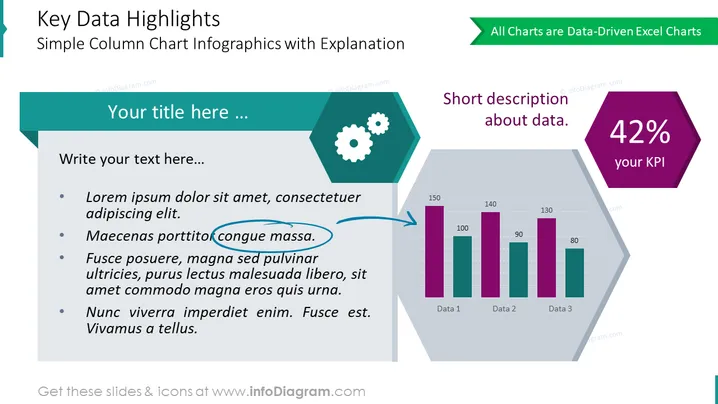
Esta es una diapositiva universal para resaltar los datos críticos en cualquier gráfico. Coloca tu diagrama en la forma hexagonal a la derecha y pon la métrica crucial arriba. Agrega una descripción si es necesario. Usa el amplio contenedor de texto a la izquierda para explicar en detalle el significado de este número crítico.
Esta Plantilla Simple de Gráfico de Columnas para Destacados de Datos Clave es parte de nuestra Plantilla PPT de Gráficos Orientados a Datos de Gráficos de Barras y Columnas.


