Your graphics add a nice touch to my presentations and I recently used them for one of my all-hands meetings. Your toolbox adds professionalism to my slides. Instead of using standard clipart.
Claude Jones, Director of Engineer, @Walmartlabs, USA
Your graphics add a nice touch to my presentations and I recently used them for one of my all-hands meetings. Your toolbox adds professionalism to my slides. Instead of using standard clipart.
Claude Jones, Director of Engineer, @Walmartlabs, USA
I needed a fresh look at some of my slides. I've tried to find a way to create a paintbrush effect, to underline, accentuate, add some color and the handwritten markers were just the things. Very easy to use, easy to size, change the color. It was an affordable, perfect solution and I'm happy to recommend it.
Anonymous, US
The crisp, clean look of the graphics, and the fact that it allowed me to easily edit and change the colors to match the template was my main reason for purchasing them.
Brandie Jenkins, E-learning Developer, USA
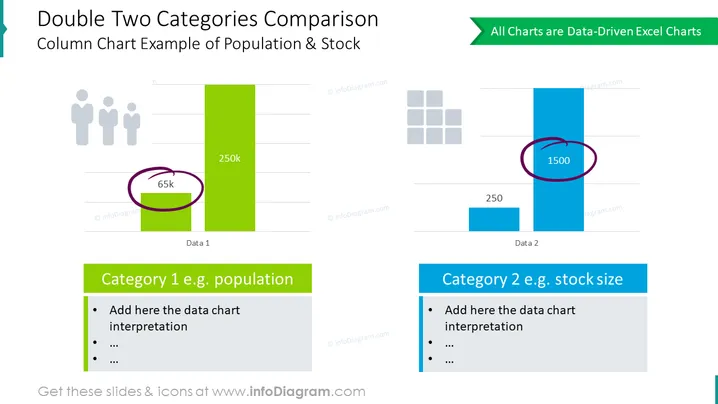
En esta diapositiva, hemos colocado gráficos de barras de comparación doble para 2 categorías para mostrar la relación entre la población y las métricas del tamaño del stock. Estos son diagramas impulsados por datos de Excel, y todos sus elementos son editables. Usa o reemplaza los íconos proporcionados, edita los marcadores de descripción y adapta los colores de la diapositiva a tus necesidades.
Esta Diapositiva de Comparación Doble de Dos Categorías Representada Con Gráfico de Columnas es parte de nuestra Plantilla PPT de Gráficos Impulsados por Datos de Gráficos de Barras y Columnas.


