Your graphics add a nice touch to my presentations and I recently used them for one of my all-hands meetings. Your toolbox adds professionalism to my slides. Instead of using standard clipart.
Claude Jones, Director of Engineer, @Walmartlabs, USA
Your graphics add a nice touch to my presentations and I recently used them for one of my all-hands meetings. Your toolbox adds professionalism to my slides. Instead of using standard clipart.
Claude Jones, Director of Engineer, @Walmartlabs, USA
I needed a fresh look at some of my slides. I've tried to find a way to create a paintbrush effect, to underline, accentuate, add some color and the handwritten markers were just the things. Very easy to use, easy to size, change the color. It was an affordable, perfect solution and I'm happy to recommend it.
Anonymous, US
The crisp, clean look of the graphics, and the fact that it allowed me to easily edit and change the colors to match the template was my main reason for purchasing them.
Brandie Jenkins, E-learning Developer, USA
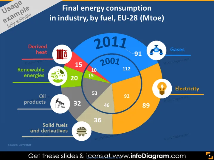
La diapositiva presenta datos sobre el consumo final de energía en el sector industrial según diferentes tipos de combustible dentro de los países de la UE-28, medidos en millones de toneladas equivalentes de petróleo (Mtep) para el año 2011. Muestra que el mayor consumo proviene de los gases (91 Mtep), seguido de la electricidad (89 Mtep), los productos petroleros (53 Mtep), los combustibles sólidos y derivados (36 Mtep), las energías renovables (20 Mtep) y el calor derivado (15 Mtep). Cada tipo de energía es crucial para entender el comportamiento de la industria; por ejemplo, la dependencia de los gases indica un uso significativo de gas natural en la industria.


