Your graphics add a nice touch to my presentations and I recently used them for one of my all-hands meetings. Your toolbox adds professionalism to my slides. Instead of using standard clipart.
Claude Jones, Director of Engineer, @Walmartlabs, USA
Your graphics add a nice touch to my presentations and I recently used them for one of my all-hands meetings. Your toolbox adds professionalism to my slides. Instead of using standard clipart.
Claude Jones, Director of Engineer, @Walmartlabs, USA
I needed a fresh look at some of my slides. I've tried to find a way to create a paintbrush effect, to underline, accentuate, add some color and the handwritten markers were just the things. Very easy to use, easy to size, change the color. It was an affordable, perfect solution and I'm happy to recommend it.
Anonymous, US
The crisp, clean look of the graphics, and the fact that it allowed me to easily edit and change the colors to match the template was my main reason for purchasing them.
Brandie Jenkins, E-learning Developer, USA
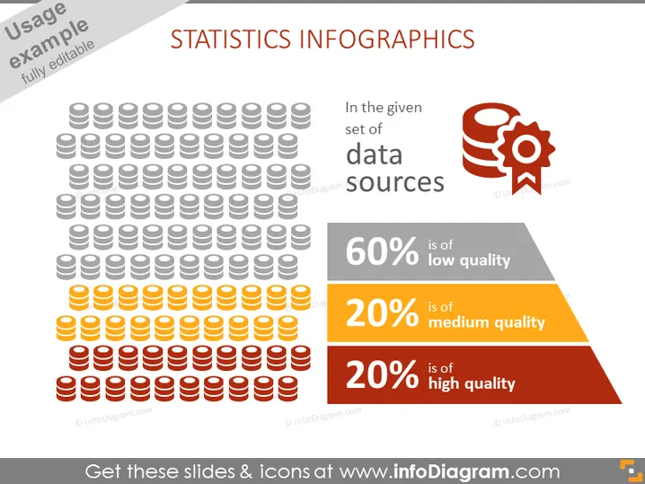
La diapositiva de PowerPoint se titula "INFOGRAPHÍAS ESTADÍSTICAS" y contiene representaciones visuales para representar la calidad de las fuentes de datos. Muestra un gran grupo de figuras iconográficas simbolizando pilas de bases de datos, con colores variados que significan diferentes niveles de calidad de datos: 60% baja calidad, 20% calidad media y 20% alta calidad, ofreciendo a los espectadores una comprensión instantánea de las proporciones de cada categoría de calidad de datos.
La diapositiva emplea un sistema de codificación de colores para comunicar fácilmente el concepto de calidad de datos. El diseño es equilibrado, con gráficos a la izquierda y texto explicativo a la derecha, asegurando una presentación visualmente atractiva y fácil de seguir.


