Your graphics add a nice touch to my presentations and I recently used them for one of my all-hands meetings. Your toolbox adds professionalism to my slides. Instead of using standard clipart.
Claude Jones, Director of Engineer, @Walmartlabs, USA
Your graphics add a nice touch to my presentations and I recently used them for one of my all-hands meetings. Your toolbox adds professionalism to my slides. Instead of using standard clipart.
Claude Jones, Director of Engineer, @Walmartlabs, USA
I needed a fresh look at some of my slides. I've tried to find a way to create a paintbrush effect, to underline, accentuate, add some color and the handwritten markers were just the things. Very easy to use, easy to size, change the color. It was an affordable, perfect solution and I'm happy to recommend it.
Anonymous, US
The crisp, clean look of the graphics, and the fact that it allowed me to easily edit and change the colors to match the template was my main reason for purchasing them.
Brandie Jenkins, E-learning Developer, USA
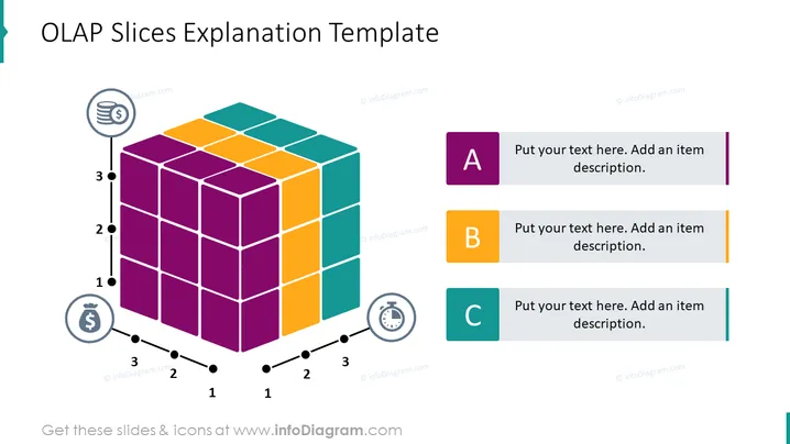
La diapositiva de PowerPoint titulada "Plantilla de Explicación de Slices OLAP" probablemente presenta una visión general de cómo se organizan los datos OLAP (Procesamiento Analítico en Línea) en slices para un análisis fácil. El cubo representa datos multidimensionales, mientras que las secciones etiquetadas—A, B y C—cada una con espacio para texto explicativo, sugieren que la diapositiva está destinada a ayudar a la audiencia a comprender partes o dimensiones específicas del corte de datos OLAP.
La diapositiva presenta un formato limpio y visualmente atractivo con un diseño bien organizado que equilibra efectivamente los gráficos con el texto. El uso de colores vibrantes y etiquetas claras ayuda a enfatizar elementos cruciales del concepto OLAP.


