Your graphics add a nice touch to my presentations and I recently used them for one of my all-hands meetings. Your toolbox adds professionalism to my slides. Instead of using standard clipart.
Claude Jones, Director of Engineer, @Walmartlabs, USA
Your graphics add a nice touch to my presentations and I recently used them for one of my all-hands meetings. Your toolbox adds professionalism to my slides. Instead of using standard clipart.
Claude Jones, Director of Engineer, @Walmartlabs, USA
I needed a fresh look at some of my slides. I've tried to find a way to create a paintbrush effect, to underline, accentuate, add some color and the handwritten markers were just the things. Very easy to use, easy to size, change the color. It was an affordable, perfect solution and I'm happy to recommend it.
Anonymous, US
The crisp, clean look of the graphics, and the fact that it allowed me to easily edit and change the colors to match the template was my main reason for purchasing them.
Brandie Jenkins, E-learning Developer, USA
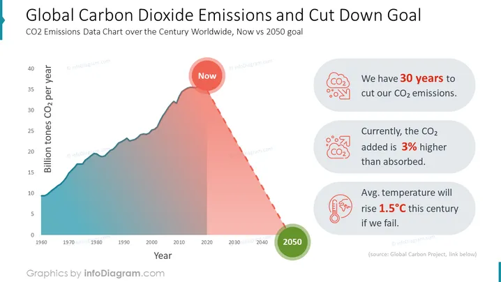
Una representación gráfica de los datos de emisiones de CO2 a lo largo del tiempo ilustra un objetivo de reducción significativa para 2050. Es una herramienta crítica en una presentación de PowerPoint para discusiones sobre estrategias de acción climática, utilizando datos para resaltar la urgencia de reducir las emisiones dentro de un marco de tiempo especificado, convirtiéndolo en una parte clave de la narrativa en la planificación empresarial relacionada con el clima.


