

Your graphics add a nice touch to my presentations and I recently used them for one of my all-hands meetings. Your toolbox adds professionalism to my slides. Instead of using standard clipart.
Claude Jones, Director of Engineer, @Walmartlabs, USA

Your graphics add a nice touch to my presentations and I recently used them for one of my all-hands meetings. Your toolbox adds professionalism to my slides. Instead of using standard clipart.
Claude Jones, Director of Engineer, @Walmartlabs, USA
I needed a fresh look at some of my slides. I've tried to find a way to create a paintbrush effect, to underline, accentuate, add some color and the handwritten markers were just the things. Very easy to use, easy to size, change the color. It was an affordable, perfect solution and I'm happy to recommend it.
Anonymous, US
The crisp, clean look of the graphics, and the fact that it allowed me to easily edit and change the colors to match the template was my main reason for purchasing them.
Brandie Jenkins, E-learning Developer, USA
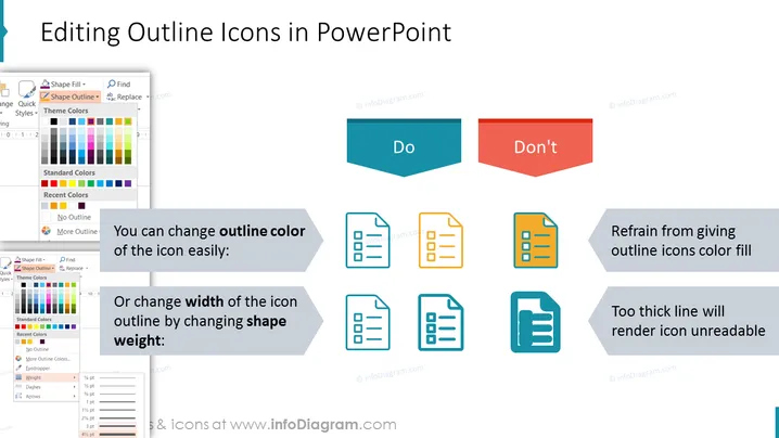
La diapositiva presenta pautas sobre cómo editar adecuadamente los iconos de contorno en PowerPoint para mantener la claridad y legibilidad. Aconseja que se puede cambiar fácilmente el color del contorno del icono o ajustar el grosor del contorno del icono alterando el peso de la forma. Por el contrario, se desaconseja rellenar los iconos de contorno con color o usar líneas que sean demasiado gruesas, ya que estas prácticas pueden dificultar la lectura de los iconos. Cada punto se demuestra con ejemplos pictóricos que muestran los métodos preferidos y desalentados.



