Your graphics add a nice touch to my presentations and I recently used them for one of my all-hands meetings. Your toolbox adds professionalism to my slides. Instead of using standard clipart.
Claude Jones, Director of Engineer, @Walmartlabs, USA
Your graphics add a nice touch to my presentations and I recently used them for one of my all-hands meetings. Your toolbox adds professionalism to my slides. Instead of using standard clipart.
Claude Jones, Director of Engineer, @Walmartlabs, USA
I needed a fresh look at some of my slides. I've tried to find a way to create a paintbrush effect, to underline, accentuate, add some color and the handwritten markers were just the things. Very easy to use, easy to size, change the color. It was an affordable, perfect solution and I'm happy to recommend it.
Anonymous, US
The crisp, clean look of the graphics, and the fact that it allowed me to easily edit and change the colors to match the template was my main reason for purchasing them.
Brandie Jenkins, E-learning Developer, USA
Desafortunadamente, no hay un título de diapositiva explícito presente en la imagen proporcionada.
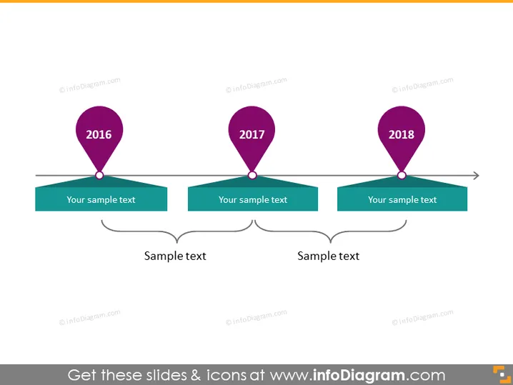
La diapositiva de PowerPoint representa una línea de tiempo con tres hitos para los años 2016, 2017 y 2018. Cada año está marcado con un ícono de pin de ubicación específico, sugiriendo eventos o etapas significativas. Debajo de cada año, hay un cuadro de texto para agregar información descriptiva sobre cada hito. Esto ayuda a explicar la importancia de cada año en la línea de tiempo. Además, hay dos cuadros de texto interconectados en la parte inferior, potencialmente para resumir o establecer conexiones entre los hitos.
La diapositiva tiene una apariencia limpia y profesional, con un estilo minimalista que evita el desorden. El uso de colores llamativos para los pines y la conexión a sus respectivos cuadros de texto hace que la línea de tiempo sea visualmente atractiva y fácil de seguir.


