Your graphics add a nice touch to my presentations and I recently used them for one of my all-hands meetings. Your toolbox adds professionalism to my slides. Instead of using standard clipart.
Claude Jones, Director of Engineer, @Walmartlabs, USA
Your graphics add a nice touch to my presentations and I recently used them for one of my all-hands meetings. Your toolbox adds professionalism to my slides. Instead of using standard clipart.
Claude Jones, Director of Engineer, @Walmartlabs, USA
I needed a fresh look at some of my slides. I've tried to find a way to create a paintbrush effect, to underline, accentuate, add some color and the handwritten markers were just the things. Very easy to use, easy to size, change the color. It was an affordable, perfect solution and I'm happy to recommend it.
Anonymous, US
The crisp, clean look of the graphics, and the fact that it allowed me to easily edit and change the colors to match the template was my main reason for purchasing them.
Brandie Jenkins, E-learning Developer, USA
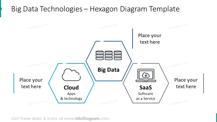
La diapositiva es una plantilla para presentar tecnologías de Big Data a través de un diagrama hexagonal, con tres componentes principales: Nube, Big Data y SaaS (Software como Servicio). Cada tecnología está encapsulada en su propio hexágono, siendo el hexágono central destacado como Big Data. La nube se describe como "Aplicaciones y tecnología," mientras que SaaS se resume como "Software como Servicio." El diagrama indica que estas tecnologías están conectadas y potencialmente interdependientes.
La diapositiva utiliza un diseño minimalista con formas hexagonales para representar la interconexión de las modernas tecnologías de Big Data. Los íconos son simples y se relacionan directamente con la tecnología que representan, creando una visualización fácil de entender.


