

Your graphics add a nice touch to my presentations and I recently used them for one of my all-hands meetings. Your toolbox adds professionalism to my slides. Instead of using standard clipart.
Claude Jones, Director of Engineer, @Walmartlabs, USA

Your graphics add a nice touch to my presentations and I recently used them for one of my all-hands meetings. Your toolbox adds professionalism to my slides. Instead of using standard clipart.
Claude Jones, Director of Engineer, @Walmartlabs, USA
I needed a fresh look at some of my slides. I've tried to find a way to create a paintbrush effect, to underline, accentuate, add some color and the handwritten markers were just the things. Very easy to use, easy to size, change the color. It was an affordable, perfect solution and I'm happy to recommend it.
Anonymous, US
The crisp, clean look of the graphics, and the fact that it allowed me to easily edit and change the colors to match the template was my main reason for purchasing them.
Brandie Jenkins, E-learning Developer, USA
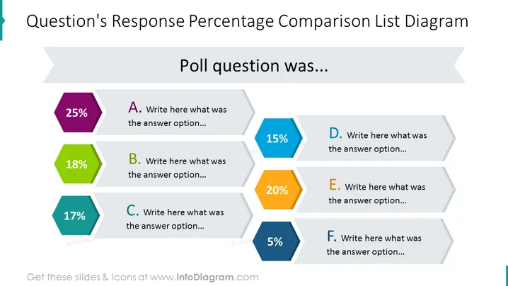
La diapositiva muestra un diagrama de lista de comparación para las respuestas a una pregunta de encuesta. Se presentan seis opciones (A-F), cada una acompañada de un valor porcentual que indica su participación en el total de respuestas. Las opciones están denotadas con diferentes colores y polígonos:
La diapositiva tiene un diseño moderno y limpio, utilizando hexágonos codificados por colores para representar visualmente los datos de encuestas. La disposición es simétrica con una jerarquía clara, lo que facilita la comparación de los puntos de datos de un vistazo.



