
Your graphics add a nice touch to my presentations and I recently used them for one of my all-hands meetings. Your toolbox adds professionalism to my slides. Instead of using standard clipart.
Claude Jones, Director of Engineer, @Walmartlabs, USA
Your graphics add a nice touch to my presentations and I recently used them for one of my all-hands meetings. Your toolbox adds professionalism to my slides. Instead of using standard clipart.
Claude Jones, Director of Engineer, @Walmartlabs, USA
I needed a fresh look at some of my slides. I've tried to find a way to create a paintbrush effect, to underline, accentuate, add some color and the handwritten markers were just the things. Very easy to use, easy to size, change the color. It was an affordable, perfect solution and I'm happy to recommend it.
Anonymous, US
The crisp, clean look of the graphics, and the fact that it allowed me to easily edit and change the colors to match the template was my main reason for purchasing them.
Brandie Jenkins, E-learning Developer, USA
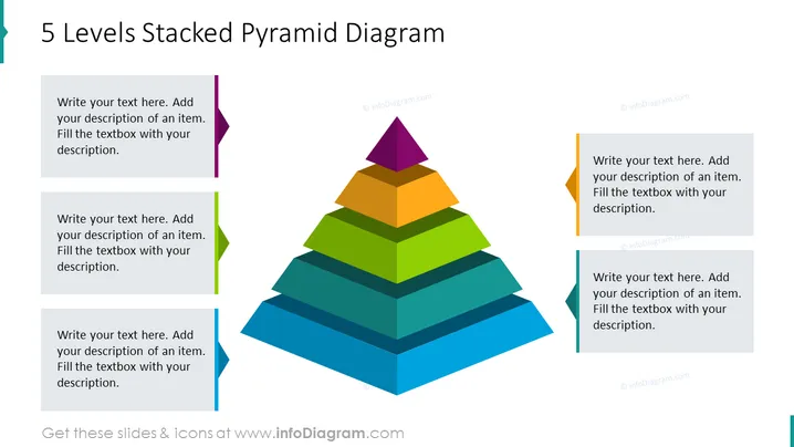
El "Diagrama de Pirámide Apilada de 5 Niveles" muestra una estructura jerárquica con cinco capas de colores, cada una representando un nivel diferente que puede ser personalizado con descripciones específicas. Estas capas pueden simbolizar etapas progresivas en un proceso, niveles de prioridad o fases de desarrollo. Comenzando desde la base, las capas están coloreadas en tonos de azul, verde, naranja y amarillo, culminando en un ápice púrpura, guiando al espectador a entender la relación escalonada donde cada segmento se basa en el anterior.




