Your graphics add a nice touch to my presentations and I recently used them for one of my all-hands meetings. Your toolbox adds professionalism to my slides. Instead of using standard clipart.
Claude Jones, Director of Engineer, @Walmartlabs, USA
Your graphics add a nice touch to my presentations and I recently used them for one of my all-hands meetings. Your toolbox adds professionalism to my slides. Instead of using standard clipart.
Claude Jones, Director of Engineer, @Walmartlabs, USA
I needed a fresh look at some of my slides. I've tried to find a way to create a paintbrush effect, to underline, accentuate, add some color and the handwritten markers were just the things. Very easy to use, easy to size, change the color. It was an affordable, perfect solution and I'm happy to recommend it.
Anonymous, US
The crisp, clean look of the graphics, and the fact that it allowed me to easily edit and change the colors to match the template was my main reason for purchasing them.
Brandie Jenkins, E-learning Developer, USA
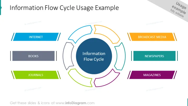
La diapositiva de PowerPoint describe un concepto llamado el "Ciclo de Flujo de Información," representado por un diagrama central circular rodeado de segmentos etiquetados. Cada segmento representa una fuente de información: Internet (destacado con dos líneas azules), Libros (en gris oscuro), Revistas (en verde), Medios de Comunicación (con dos líneas naranjas), Periódicos (en verde azulado) y Revistas (en púrpura). Internet implica fuentes en línea, los Libros sugieren literatura tradicional, las Revistas denotan artículos académicos, los Medios de Comunicación significan televisión y radio, los Periódicos indican noticias escritas diarias, y las Revistas implican publicaciones periódicas.


