

Your graphics add a nice touch to my presentations and I recently used them for one of my all-hands meetings. Your toolbox adds professionalism to my slides. Instead of using standard clipart.
Claude Jones, Director of Engineer, @Walmartlabs, USA

Your graphics add a nice touch to my presentations and I recently used them for one of my all-hands meetings. Your toolbox adds professionalism to my slides. Instead of using standard clipart.
Claude Jones, Director of Engineer, @Walmartlabs, USA
I needed a fresh look at some of my slides. I've tried to find a way to create a paintbrush effect, to underline, accentuate, add some color and the handwritten markers were just the things. Very easy to use, easy to size, change the color. It was an affordable, perfect solution and I'm happy to recommend it.
Anonymous, US
The crisp, clean look of the graphics, and the fact that it allowed me to easily edit and change the colors to match the template was my main reason for purchasing them.
Brandie Jenkins, E-learning Developer, USA
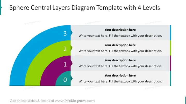
La diapositiva está diseñada para representar un enfoque por capas a un concepto o estructura con cuatro niveles distintos, etiquetados del 0 al 3. Cada capa corresponde a un nivel más amplio de detalle o jerarquía y contiene texto de marcador de posición para una descripción. El nivel '0' podría representar el núcleo o la base de una idea, mientras que el nivel '3' podría representar la capa más externa, posiblemente indicando un concepto más avanzado o menos central en la estructura general. Esta metáfora visual demuestra efectivamente cómo los diferentes elementos se construyen unos sobre otros dentro de un sistema o proceso.
La diapositiva tiene un diseño limpio y moderno con un gráfico audaz que atrae efectivamente la atención hacia la estructura por capas. El uso de colores distintos para cada capa mejora la separación y la jerarquía visual.



